Case Study
Exilia was inspired by the work of designers from the modern movement like Jan Tschichold, Paul Renner and Wim Crouwel. Beyond aesthetics contributions of these revolutionary figures, the main inspiration came from their philosophy, consistency and discipline that seems to be as relevant today as when it was first implemented, more than 50 years ago.
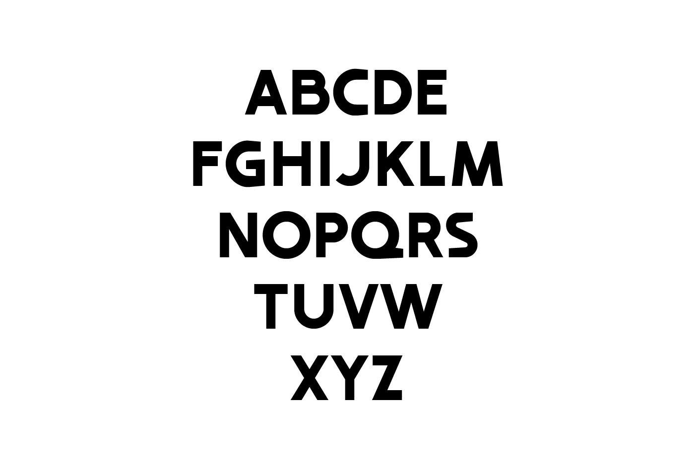
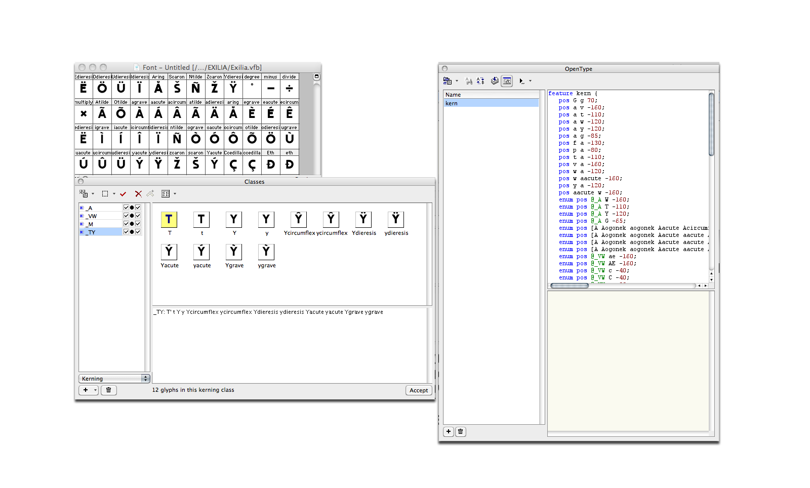
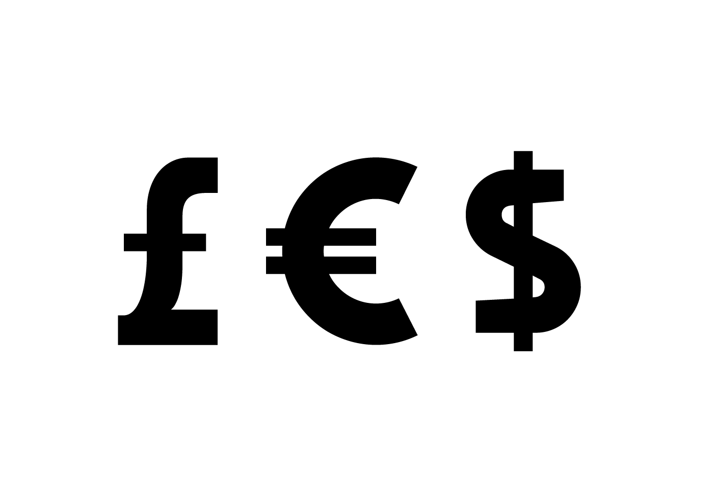
This project was a 3 years long personal journey, a slow yet constant process re-discovering the elements of typography anatomy and studying the capabilities of FontLab, a digital font development software. And last but not least, spending hundred of hours sketching, vectorizing and finally coding the most used 344 glyphs that conformed the latin alphabet -including diacritics, ligatures, numbers and special characters-.
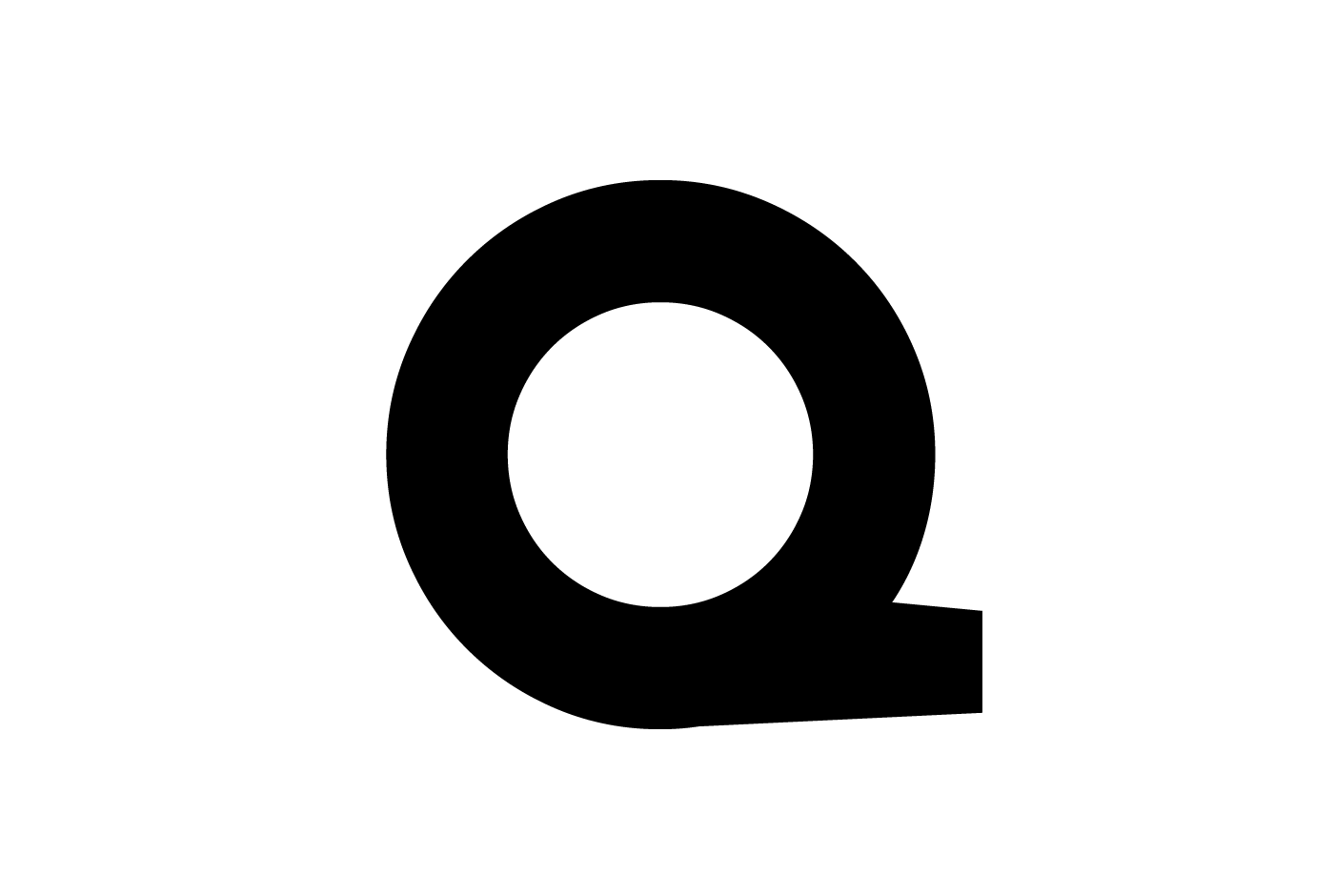
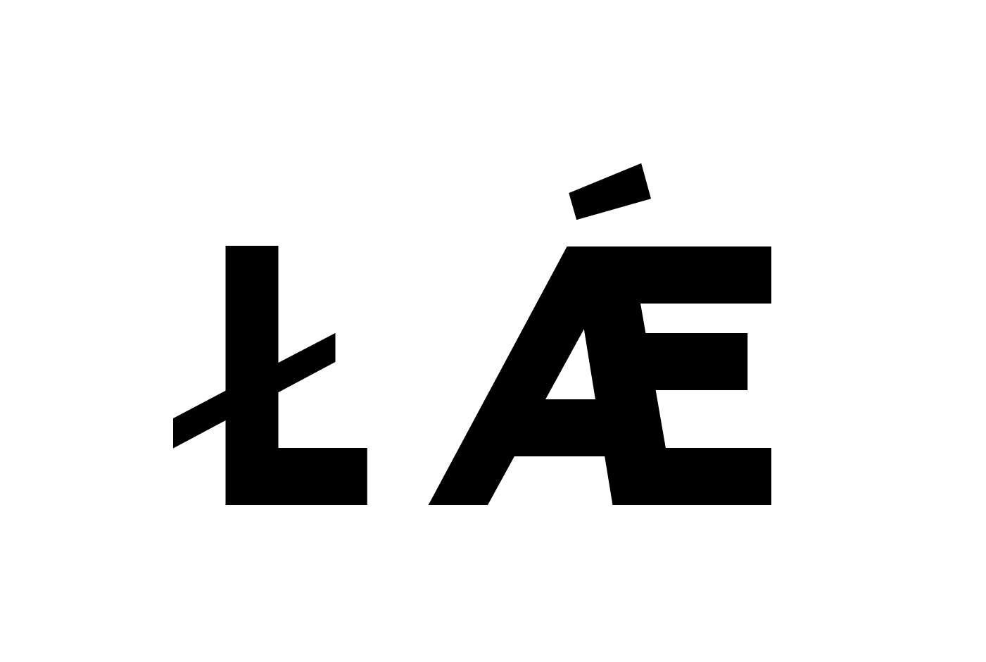
Exilia´s gravitas relies on concepts like rationality and geometry, its robust taxonomy was built using a grid to perform unity and consistency across every character. Yet the type sought to speak a different language within the sans serif group, implementing capricious design decisions for aesthetic enjoyment without disturbing legibility, breaking the frivolous sentiment in pro of a discrete charisma.
