Case Study
With operations in over 170 countries, IBM manufactures and markets computer hardware, middleware and software, and provides hosting and consulting services in areas ranging from mainframe computers to nanotechnology. IBM is also a major research organization, holding the record for most patents generated by a business.
In the recent years the role of the CIO (Chief Information Officer) has been radically reimagined, a decade ago, the CIO was concerned mostly with IT infrastructure, today’s CIO faces additional challenges, like cybersecurity or cloud technology. As a response to this evolution, IBM launched the campaign “Discover what ‘I’ can disrupt”, an effort conformed by series of video ads, white papers, events, digital experiences, among other relevant content around the role of the CIO.
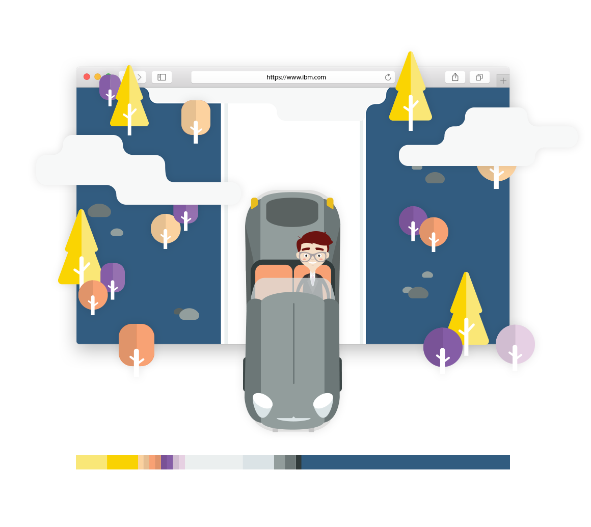
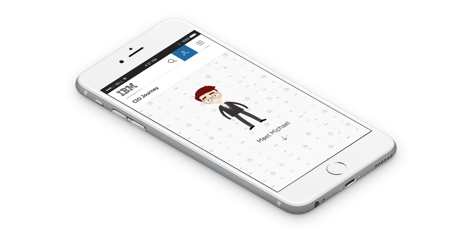
IBM needed a stand-alone, user-friendly, experience able to engage and deliver in a simple and entertaining way the content created. The experience conceived was a choose-your-own-adventure style story, where the user takes the role of the protagonist “Michael, The CIO”, making choices that determine the character’s actions, facing different options which leads to more options, discovering diverse content based on the decisions he makes.
IBM.
Narrative Taxonomy
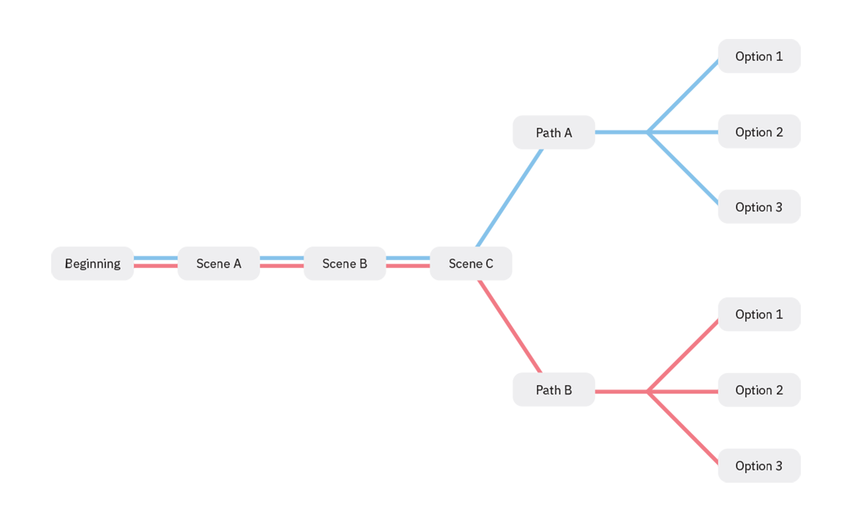
One of the first steps was designing a diagram that showed the complete narrative structure, a simple user-flow that showed every option and possible paths that the character will face as he is advancing in the story. Eventually this diagram would be indispensable to have a better understanding of the site as a whole, using it as a visual tool among all the parts involved.
After defining the user-flow diagram, I started developing a series of quick sketches to pre-visualize the possible scenes of Michael’s journey, these drawings helped me to organize every scene in a sequence, but also to easily communicate to the clients the expected outcome of the project, defining transitions and the probable position of some of the elements in each scene around the main character, also giving guidance to keep the balance between parallax elements and static content.

Moodboard
Inspired by mid-century modern design, the moodboard was combination of photography and illustrations as a way to come to an agreement about style, defining the art direction for a wide range of objects in every scene, weaving the general flavor from start to finish. It was a really fun exercise that help to shape the execution of the final illustrations and a way to keep consistency in every detail.
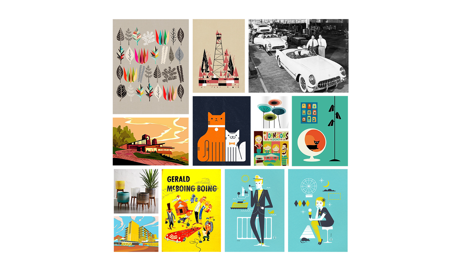
Colorscript
In films, the color script is an early attempt to map out the color, lighting, emotion and moods, I love movies and I realized this was a very cool and clever approach, I could use the color as an active character in the narrative, giving it a role telling the story of Michael through the evolution of the journey, creating a hierarchy of elements, defining composition, establishing environments and not just leaving the decision making of color to subjective aspects like taste or personal mood.
Keeping this in mind I used IBM’s design language color palette, a finite set of approximately 140 colors to developed the colorscript and color proportion for each scene, resulting in a color scheme that would be a fundamental element to keep everything in brand and consistent across IBM digital landscape.

The Journey
Time to put the pieces together, by establishing in early stages of the project aspects like content, structure, sequence, wireframing and look & feel makes the execution of the illustrations a faster -and very enjoyable- process, reducing the friction and having a clear outcome. This process helped to clear out some time to focus on other important aspects of the journey, like the right implementation of UX and UI design.
Illustrating is one fun thing -when is static-, but designing an experience while you keeping in check all the possible aspects that can affect the performance of the site across multiple devices, could be a real headache. Fortunately, having a process that keep the things simple is what makes a difference with projects with some many -literally- moving pieces.

