Case Study
With headquarters in Atlanta, FirstKey Homes offers high quality and affordable single-family homes for rent in 22 locations, in 15 states, across the United States. Just in the last six months of 2017, the company acquired 8,000 single-family rental properties, having more than 25,000 units in their current portfolio.
Facing such a fast-growing portfolio and geographical expansion in so short period of time, the company needed think quickly about how to engage with a complete new audience and help them along the way to find their dream home, interacting with a public that likely never heard before about FirstKey Home, but also improving the communications with current residents that use the site as the first point of contact with the company.
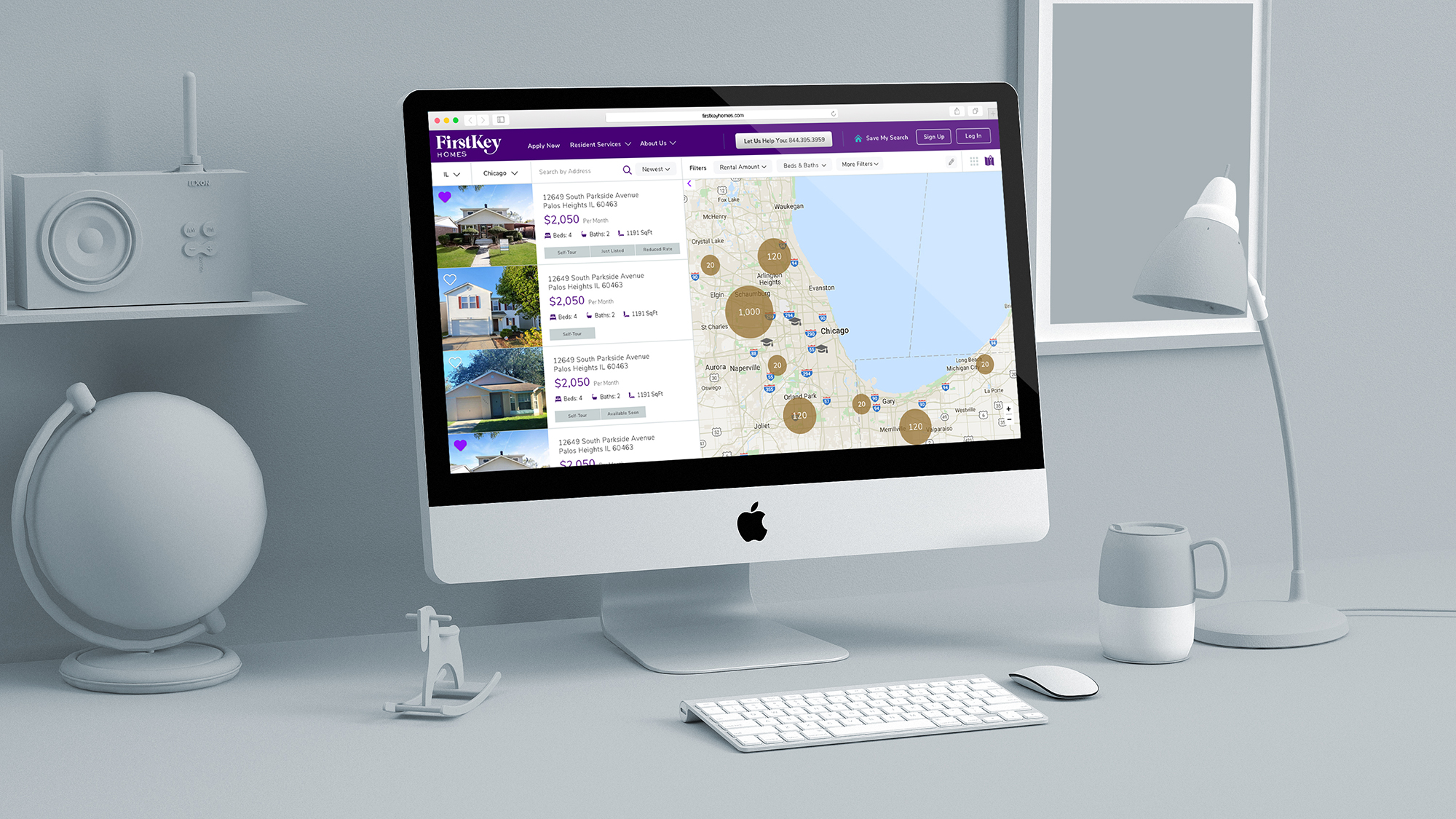
Having established this, with a bigger portfolio in their hands and presence in new regions, addressing their design’s site and infrastructure were priorities for the company. Their site would be getting high volumes of traffic, it will need a revamp look&feel to stay relevant and competitive and a better user experience to have an easy-access to its increasing portfolio.
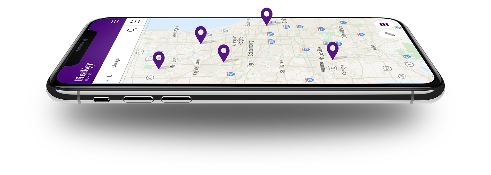
Taxonomy & User Experience
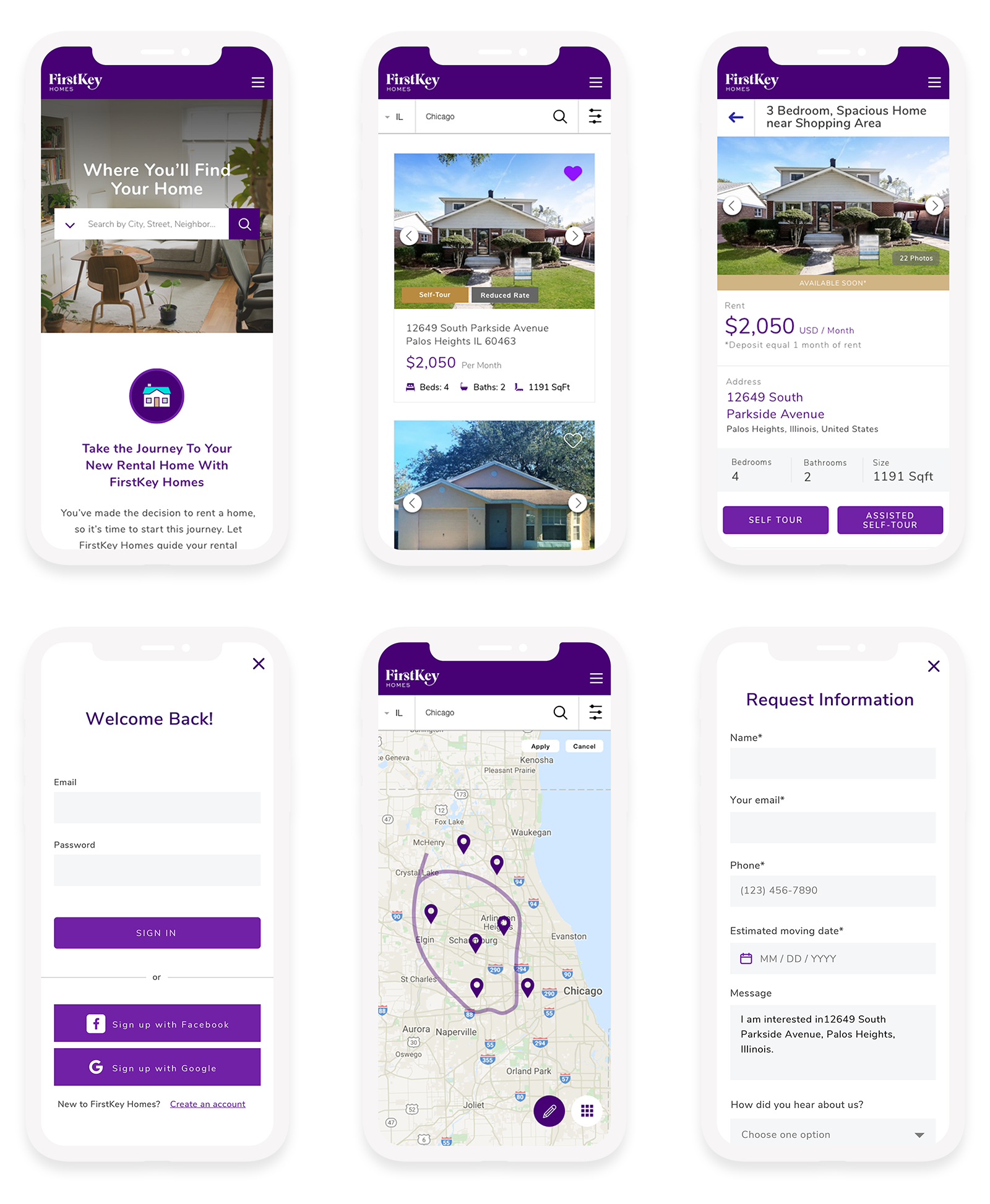
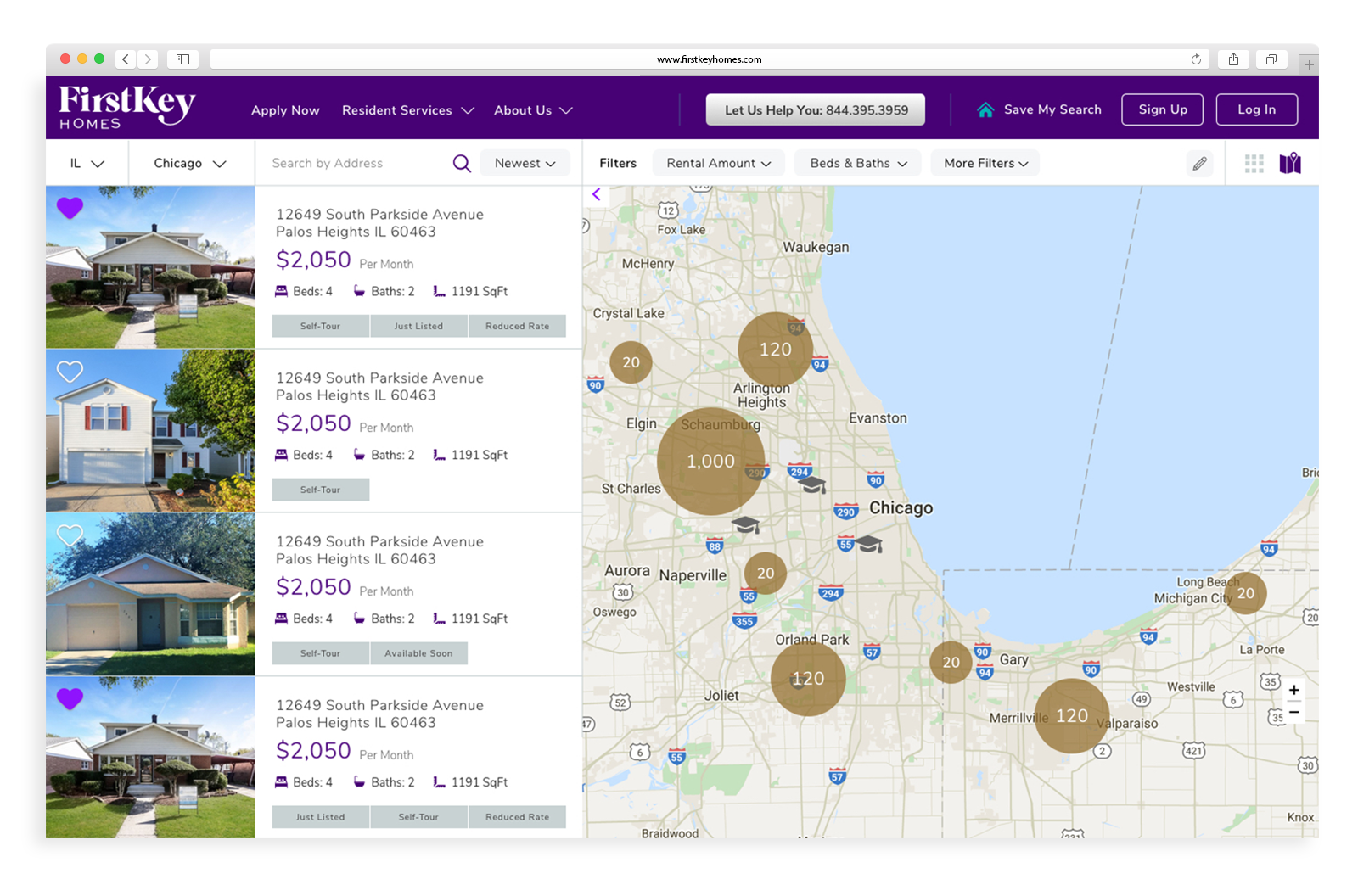
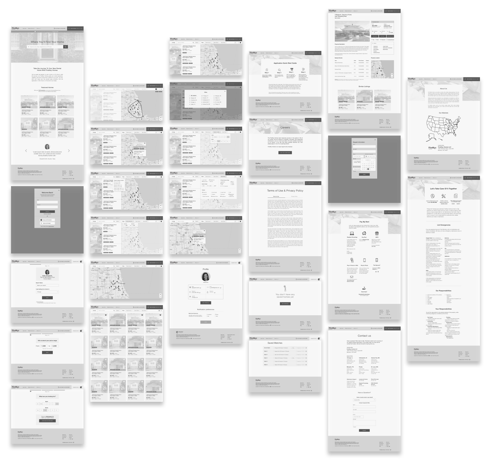
The searching and filtering features were primordial for the project, the original site was outdated and had evident pain points that make the process of finding listings and applying for a home extremely difficult for the user. More than inventing a new way to search for a property in the real estate industry, the site need to evolve and adopt what top companies in the sector have established as best practices.
Also, the site integrates third party services -like Rently- that allow future residents to visit a prospect home, taking them in an offline journey. At the same time, existing residents use the website to perform convenient actions like paying rent, assisted self-tour or online application. Knowing these factors required to improve the taxonomy to reorganize and help to the offline and online customer experience and delivered a service that must feel consistent and seamless at each touchpoint.
Looking at competitors sites was the first stop, however the most important contribution was to identify best practices in well-known platforms like Compass, Zillow and Airbnb that deal with similar challenges in terms of information and flows, but tailoring the experience to the FirstKey Homes’s user personas and journeys.
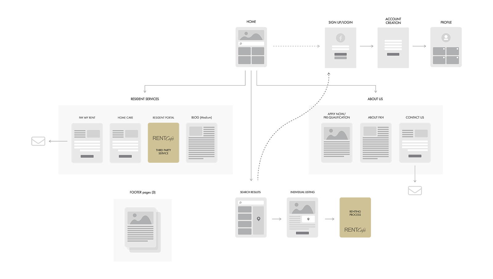
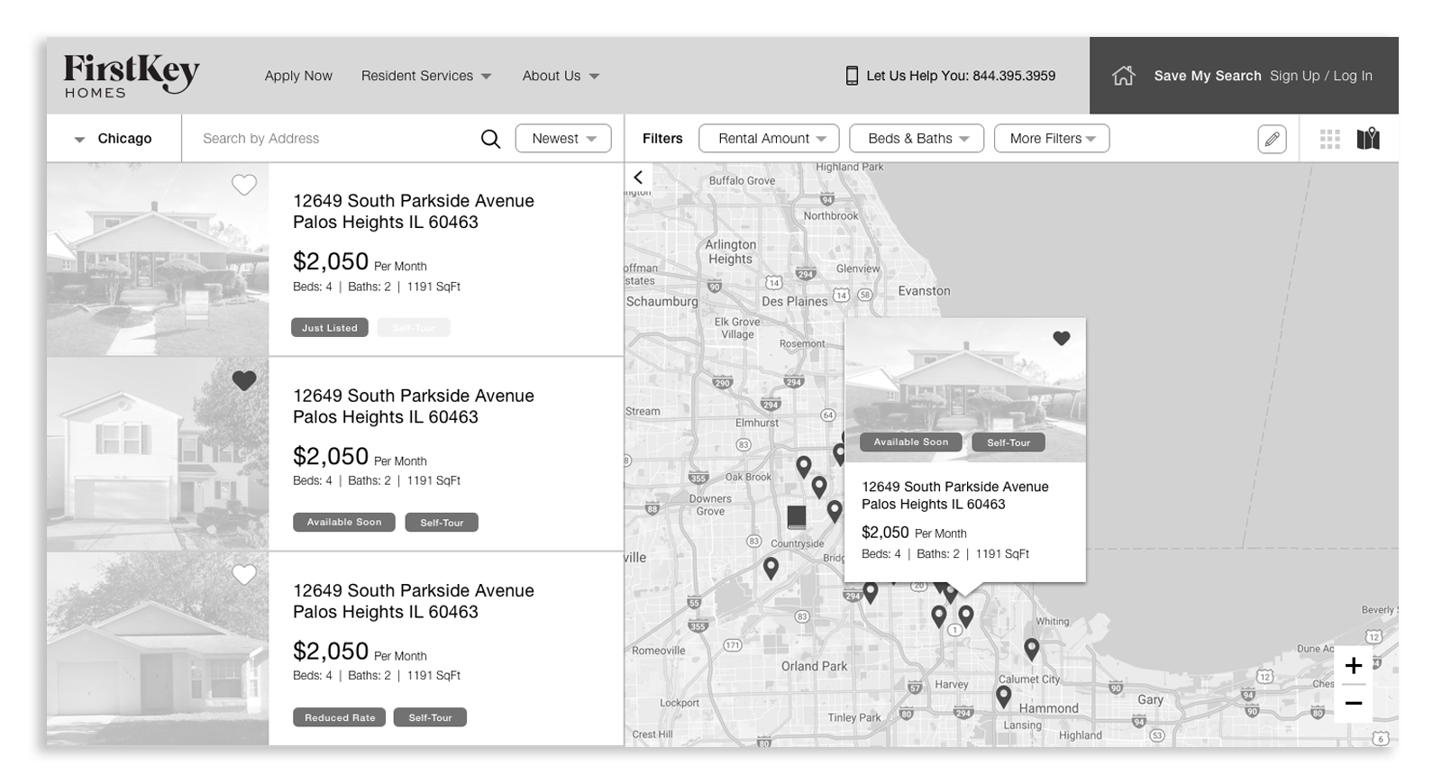
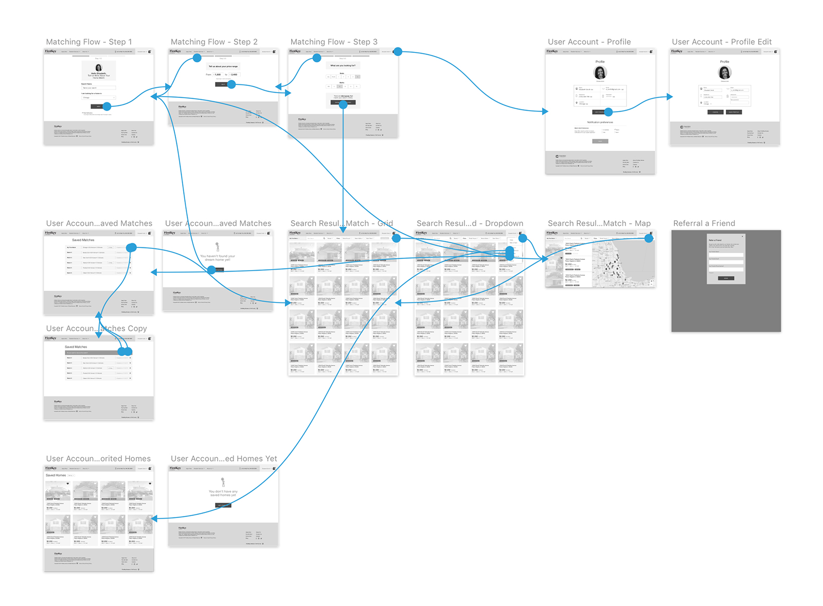
Design System & User Interface
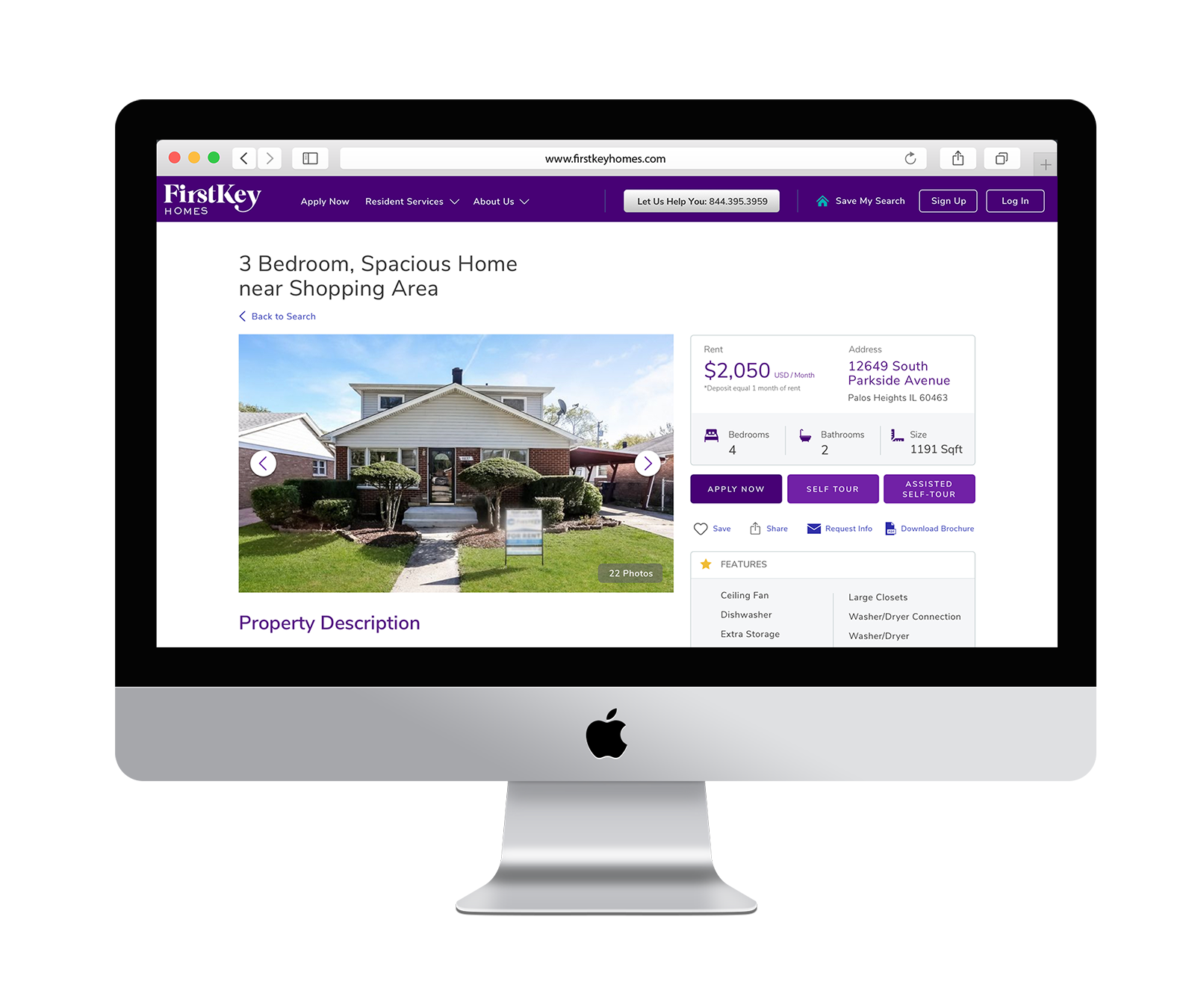
FirstKey Homes and I collaborated with the agency DiMassimo Goldstein on refreshing the company’s overall brand. The agency worked directly with FirstKey Homes focusing on redesigning the brand identity, establishing typography options and a basic color palette, without doubt these initial elements contributed to develop a design system for the site. However as any work on progress with multi-faceted creative teams involved, other aspects need to be developed.
To solve the challenge, keeping everything consistent and in brand, an extended color palette was added, typography hierarchy and rules for web were defined and an set of vignettes was designed, establishing an art direction and structure that is ownable, with care and attention to detail and will keep the audience visually engaged, keeping the look & feel consistent across different devices, so that the service can stand out of the crowd.

