Case Study
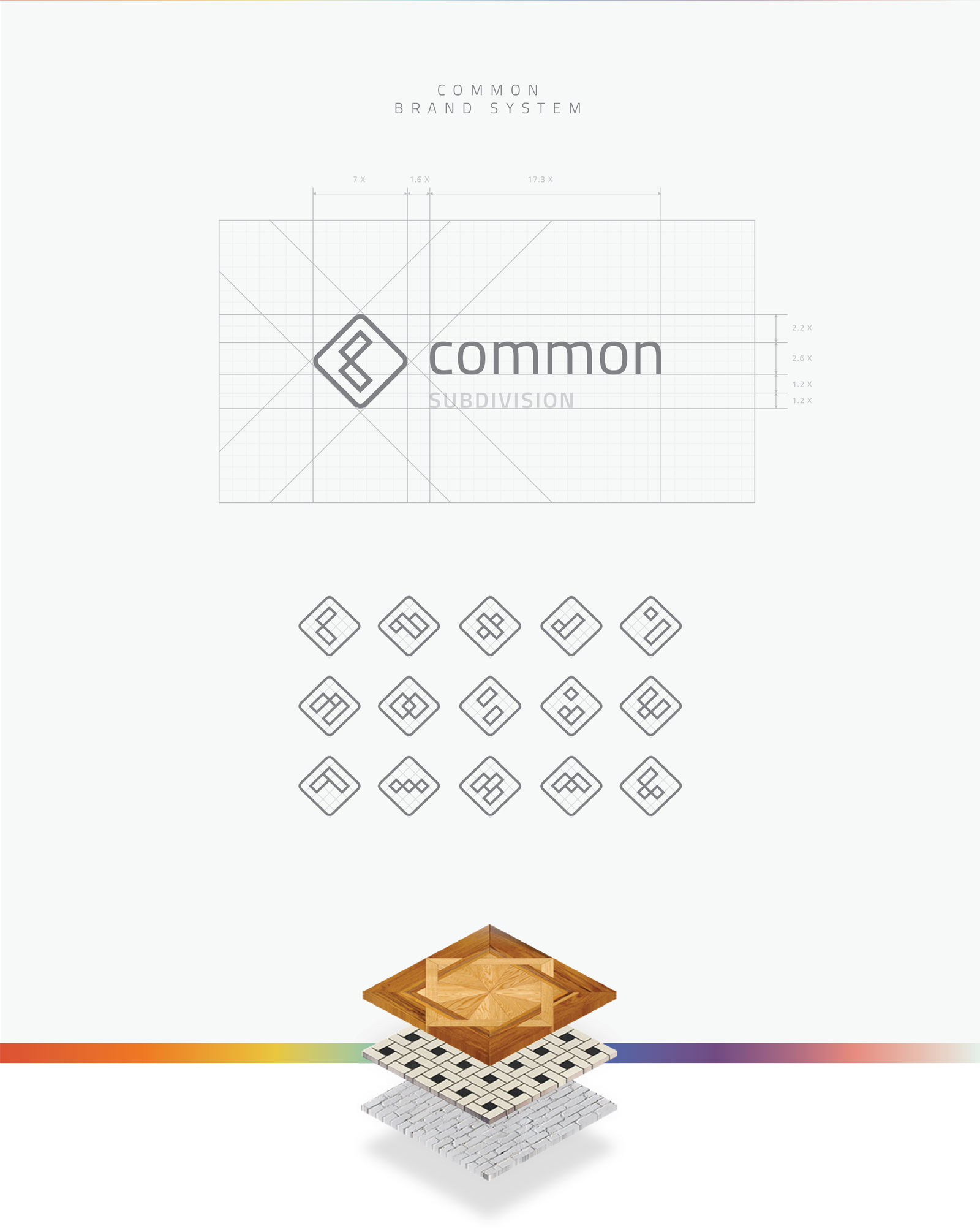
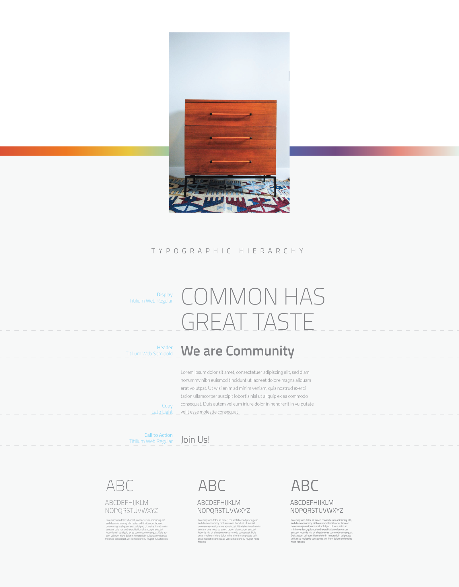
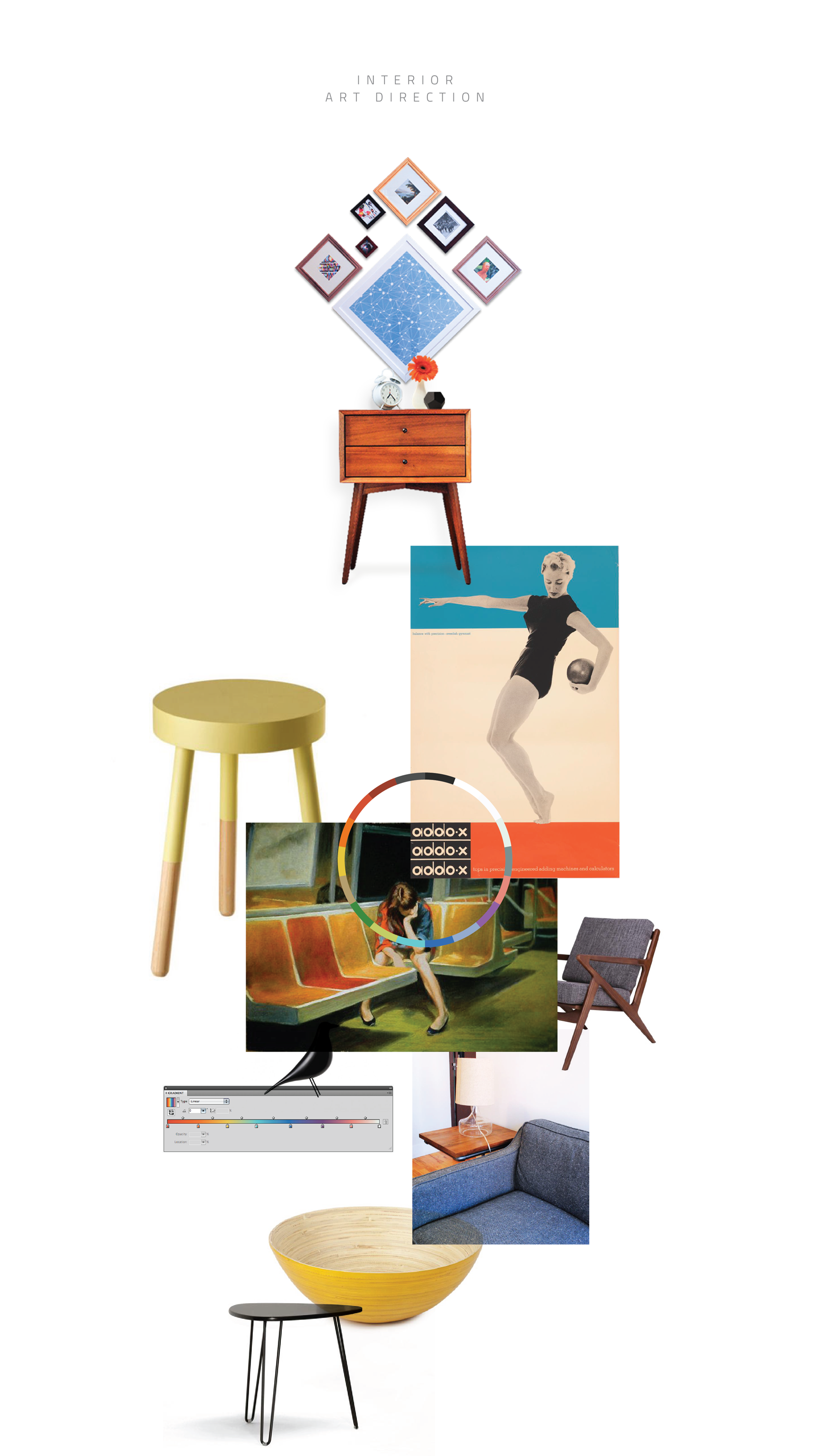
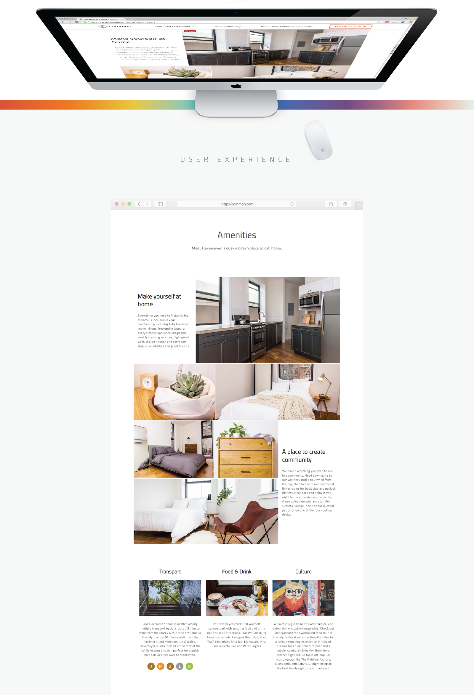
Common, a co-living fast-growing startup from General Assembly co-founder Brad Hargreaves is tackling the problem than many millennials are having when trying to rent a place in cities like New York, Washington or San Francisco. Cities where real estate laws and tenant requirements are sometimes hard to cover. “Flexible, friendly shared housing”, under this concept Common offers fully furnished spaces, private bedrooms, 24/7 laundry, weekly cleaning, super fast wi-fi, community events and the option to move to other Common locations, everything within a fixed monthly payment. The Common needed a graphic language that follows its core ideal, a flexible brand able to adapt and grow, but moreover be a platform for an always-evolving brand. Inspired by the tile arrangements and wood floor layouts that you can find in the Broadstone houses from the late 1800’s, the grid become the system to build the symbol, iconography, way finding and even a visual hint for interior design. Probing the versatility of the graphic system. The color palette is discrete but meaningful, inspired by Edward Hopper paintings, gives to Common a chromatic language to dress the brand, also a visual cue for the interior design chromatics, where furniture, art and everyday objects work all together.
